V1: March 2004 | V2: Sept 2005 | V3: July 2010 | V4: Nov 2015
I’m really excited (really really excited) about this. Today we find ourselves 11.5 years into this experiment with 3,261 posts, 30,331 approved comments, 880 tags and 30 authors. The main goal with this update is to find ways to highlight and make browsing this substantial content archive a little easier.
- We now have individual author pages. If you are interested in a voice it’s ridiculously easy to find out a little something about that person and browse their entire post history. The old site didn’t even have a full author list so just this is huge progress.
- In addition to boring linear date-based archives (which are now beautiful, readable, and navigable—you’re welcome), we have topic browsing. Those word clouds are massive and overpowering but it’s kind of fun to scroll until your eye catches an interesting phrase and then click to enjoy a curated list of articles for each tag/category.
- Now that we have an integrated single stream database (thank you, sir), we finally have a full site search that actually works, with results sorted by a relevancy score and displayed in a readable style that highlights search terms.
- We’re trying out some experimental community tools. There is now a commenter history page showing individual’s recent comments. ACW has never had verified accounts for commenters so this implementation is highly imprecise and imperfect, but I still think it’s useful and interesting. Additionally, we now have the ability to subscribe to comments and blog posts to get email on updates. And finally, there’s an option to use twitter/facebook/wordpress/google persistent logins to post (or just continue filling in name/email each time).
- The ACW podcast is great and now we have better on-site podcast promotion that includes playing/browsing latest shows as well as full description and discussion links from every episode.
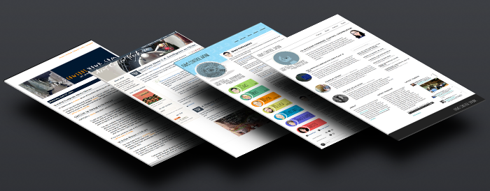
- We’ve built a responsive site redesign that’s looking great on all screen resolutions — including mobile. Wonk4 is a minimal abstraction of everything I loved about Wonk3 with an eye for an ultra clean layout, a front page news style display for quicker fast-digest of recent content, and better typography for readability. This version features a new logo by one of Jeffrey’s favorite artists, Craig Robinson. He created a beautiful abstraction of the Nuclear Effects Bomb Computer—a long-time site icon here at ACW. And, as always, signature author caricatures by José Ramos.
- And finally, there are a million little tiny micro-adjustments and details that no one will ever notice. But I’ll know, and that’s all that matters.
The end (if things break or if you have feature requests please let us know in the comments).

I think the typefaces are harder to read than before. Bias, or is there a way to prove this?
Have you tried to adjust your screen brightness?
For this update we increased the article font size (from 12px to 20px), doubled the line height and increased the column width. These changes should substantially increase readability. We did move to a thinner sans-serif typeface, so I suppose that might make the text appear lighter on some screens. We could play around with font weight if there’s a consensus that things are too light.
I notice your article search function, by keyword or subject, only goes 10 deep. Is there a way to see #s 11-20, or 21-30, etc.?
Yes! Thanks for the suggestion. Search results are paginated now.
Congrats, great job. Really modern, fresh looking. Kinda liked ACW3 looks, but I’ll soon prefer this one, that’s for sure.
Actually, I only wrote to say that and maybe reinforce the request for a somewhat darker font. The author’s name below the title, for instance, is easier to read than the rest of the page.
I think I would second the comments of Bradley and Leandro above. There is something about the typeface (thinner, whatever) that could make it hard to read on some monitors. On my work computer, it looks crisp black on white; on my home computer, it looks dark grey on a light grey background. I can still read it, but I can see how some eyes won’t like it and prolonged reading could cause eye strain.
I agree with the others. The font is too thin, and it makes it considerably more difficult to read.
Message received regarding the font weight. We’ll build out an option to switch to a heaver font for those who prefer it.